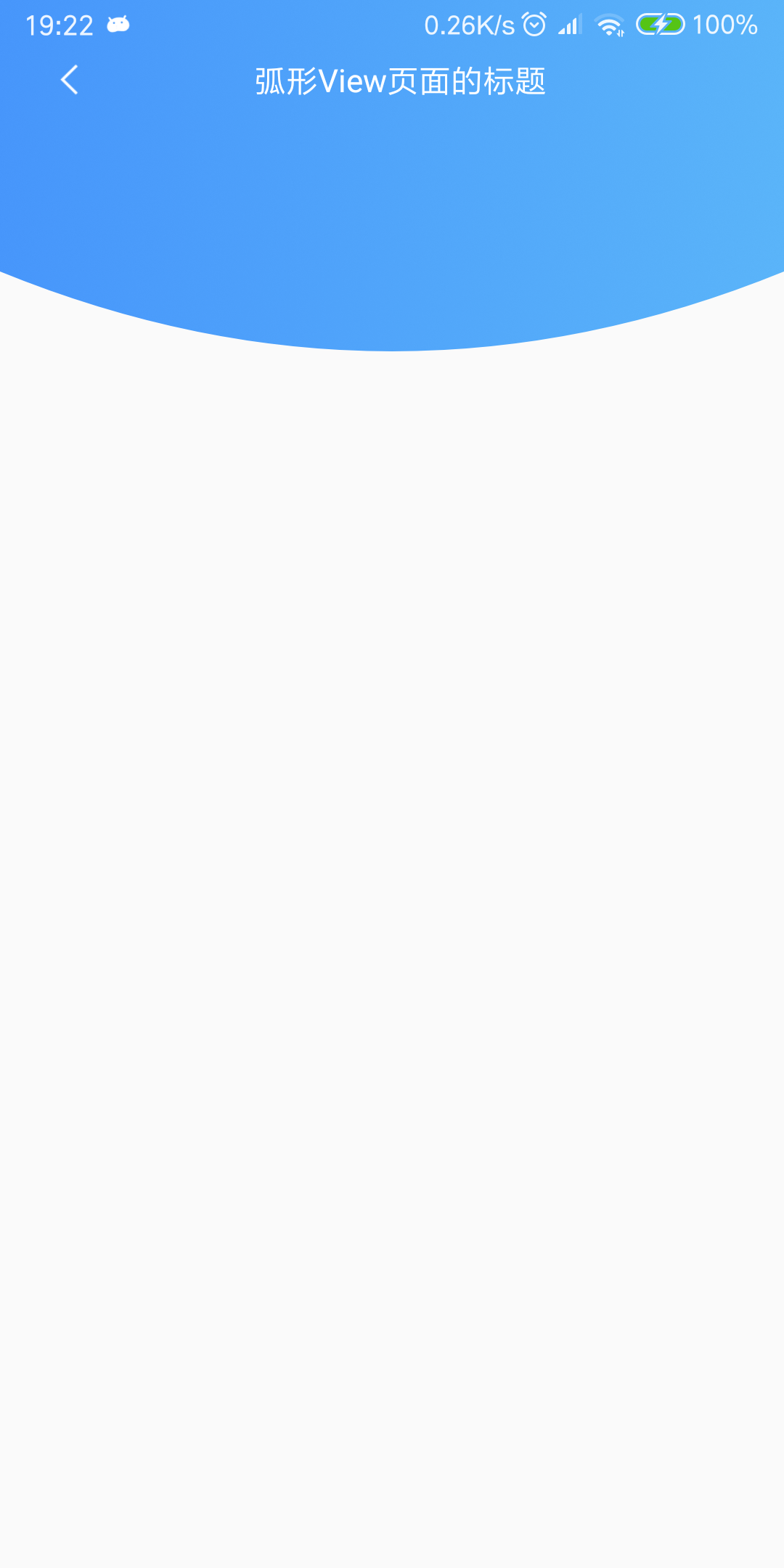
来,先看下效果图:
怎么样?漂亮吧,上面是一个标题栏,下面是一个弧形的 View,标题栏和弧形 View 从左到右都有一个线性的渐变色,类似于手机 QQ 顶部的渐变效果,关于弧形的这种效果,使用的场景还是比较普遍的,小面我们就一起来看看如何绘制吧。
1.先自定义一个 ArcView 创建一个类 ArcView 继承于 View,然后我们重写其三个构造方法,还有 onMeasure() 和 onDraw() 方法,这都是自定义 View 最基本的写法,比较简单这里就不详细说了, onMeasure() 用于测量 View 的宽高尺寸,onDraw() 就是具体的绘制过程了,具体的绘制思路是:我们在 onMeasure()方法中拿到测量出来的宽和高,然后再 onDraw() 中初始化一个画笔,我们可以创建一个 LinearGradient 对象,然后调用设置画笔的 setShader() 方法就可以达到画笔渐变色的效果,然后再创建一个 Rect 对象,这里只是创建了一个矩形对象,要想绘制弧形,我们还需要设置绘制的路径,创建一个 Path 对象,分别调用 moveTo() 方法,和 quadTo() 方法,moveTo ()不会进行绘制,只用于移动移动画笔,一般和其他方法配合使用,这里和 quadTo() 方法配合使用,而 quadTo() 用于绘制圆滑的曲线,即贝塞尔曲线。mPath.quadTo(x1, y1, x2, y2) 其中x1、y1 为控制点,x2、y2 为结束点。有了路径之后我们就可以轻而易举地绘制出一个弧形了,完整的代码请看下面:
1
2
3
4
5
6
7
8
9
10
11
12
13
14
15
16
17
18
19
20
21
22
23
24
25
26
27
28
29
30
31
32
33
34
35
36
37
38
39
40
41
42
43
44
45
46
47
48
49
50
51
52
53
54
55
56
57
58
59
60
61
62
63
64
65
66
67
/** * Created by Feifei on 2018/8/10 :) * Function:自定义弧形 View */ public class ArcView extends View { private int mWidth; private int mHeight; private int mArcHeight; // 弧形高度 private int mBgColor; // 背景颜色 private Paint mPaint; public ArcView(Context context) { this(context, null); } public ArcView(Context context, @Nullable AttributeSet attrs) { this(context, attrs, 0); } public ArcView(Context context, @Nullable AttributeSet attrs, int defStyleAttr) { super(context, attrs, defStyleAttr); TypedArray typedArray = context.obtainStyledAttributes(attrs, R.styleable.ArcView); mArcHeight = typedArray.getDimensionPixelSize(R.styleable.ArcView_arcHeight, 0); mBgColor = typedArray.getColor(R.styleable.ArcView_bgColor, Color.parseColor("#1E90FF")); typedArray.recycle(); mPaint = new Paint(); } @SuppressLint("DrawAllocation") @Override protected void onDraw(Canvas canvas) { super.onDraw(canvas); // 参数一为渐变起初点坐标 x 位置,参数二为 y 轴位置,参数三和四分辨对应渐变终点,最后参数为平铺方式,这里设置为镜像 LinearGradient lg = new LinearGradient(0, 0, mWidth, 0, Color.parseColor("#4796FB"), Color.parseColor("#5AB4F9"), Shader.TileMode.CLAMP); // 刚才已经讲到 Gradient 是基于 Shader 类,所以我们通过 Paint 的 setShader 方法来设置这个渐变 mPaint.setShader(lg); mPaint.setStyle(Paint.Style.FILL); //mPaint.setColor(mBgColor); mPaint.setAntiAlias(true); Rect rect = new Rect(0, 0, mWidth, mHeight - mArcHeight); canvas.drawRect(rect, mPaint); Path path = new Path(); path.moveTo(0, mHeight - mArcHeight); path.quadTo(mWidth / 2, mHeight, mWidth, mHeight - mArcHeight); canvas.drawPath(path, mPaint); } @Override protected void onMeasure(int widthMeasureSpec, int heightMeasureSpec) { super.onMeasure(widthMeasureSpec, heightMeasureSpec); int widthSize = MeasureSpec.getSize(widthMeasureSpec); int widthMode = MeasureSpec.getMode(widthMeasureSpec); int heightSize = MeasureSpec.getSize(heightMeasureSpec); int heightMode = MeasureSpec.getMode(heightMeasureSpec); if (widthMode == MeasureSpec.EXACTLY) { mWidth = widthSize; } if (heightMode == MeasureSpec.EXACTLY) { mHeight = heightSize; } setMeasuredDimension(mWidth, mHeight); } }
我这里只定义了弧形的高度和背景颜色这两个自定义属性,其中还有渐变颜色的开始色值和结束色值,还有是否需要渐变等属性,都可以定义为自定义的属性,方便直接在布局文件中灵活进行配置,以适应不同的需求,也比较简单,我这里为了就不实现了。
2.自定义一个通用的 titlebar 这样做我们可以提高代码的复用性,可以将一些功能封装进去,也更好地体现了封装的思想,实现也比较简单,使用 LayoutInflater 加载了一个布局文件,然后将 文字,字体大小,字体颜色和 title 背景色等定义成了自定义的属性,方便在布局文件中进行设置,另外我们内部默认处理了点击返回按钮的事件,对于需要其他特殊情况下返回按钮的处理,我们也定义了一个接口,方便外部使用接口来自行进行处理,代码也非常简单,看下面:
1
2
3
4
5
6
7
8
9
10
11
12
13
14
15
16
17
18
19
20
21
22
23
24
25
26
27
28
29
30
31
32
33
34
35
36
37
38
39
40
41
42
43
44
45
46
47
48
49
50
51
52
53
54
55
56
57
58
59
60
61
62
63
64
65
66
67
68
69
70
71
72
73
74
75
76
77
78
79
80
81
82
83
84
85
86
87
88
89
90
91
92
93
94
95
96
97
98
99
100
101
102
/** * Created by Feifei on 2018/9/2 :) * Function:自定义通用 TitleBar */ public class TitleBarLayout extends LinearLayout { private ImageView ivBack; private ImageView ivMenu; private TextView tvTitleName; private LinearLayout llTitleBg; private CharSequence mText; private int mTitleBgColor; private boolean mMenuVisible; private int mTextSize; private int mTextColor; private OnMenuClickListener mListener; private OnBackClickListener mOnBackListener; private static final String DEFAULT_TEXT = "Title"; // default text. private static final int DEFAULT_TEXT_SIZE = 16; // default text size. private static final String TAG = "TitleBarLayout"; public TitleBarLayout(Context context) { this(context, null); } public TitleBarLayout(Context context, @Nullable AttributeSet attrs) { this(context, attrs, 0); } public TitleBarLayout(Context context, @Nullable AttributeSet attrs, int defStyleAttr) { super(context, attrs, defStyleAttr); TypedArray typedArray = context.obtainStyledAttributes(attrs, R.styleable.TitleBarLayout); mText = typedArray.getText(R.styleable.TitleBarLayout_text); mTextSize = typedArray.getDimensionPixelSize(R.styleable.TitleBarLayout_textSize, DEFAULT_TEXT_SIZE); mTextColor = typedArray.getColor(R.styleable.TitleBarLayout_textColor, Color.parseColor("#FFFFFF")); mTitleBgColor = typedArray.getColor(R.styleable.TitleBarLayout_titleBgColor, Color.parseColor("#1E90FF")); mMenuVisible = typedArray.getBoolean(R.styleable.TitleBarLayout_menuVisible, false); typedArray.recycle(); initView(context); initData(); initListener(); } private void initView(Context context) { LayoutInflater.from(context).inflate(R.layout.common_titlebar, this); ivBack = findViewById(R.id.ivBack); ivMenu = findViewById(R.id.ivMenu); tvTitleName = findViewById(R.id.tvTitleName); llTitleBg = findViewById(R.id.llTitleBg); } private void initData() { String text = (mText != null) ? mText.toString() : DEFAULT_TEXT; tvTitleName.setText(text); tvTitleName.setTextSize(TypedValue.COMPLEX_UNIT_PX, mTextSize); tvTitleName.setTextColor(mTextColor); //llTitleBg.setBackgroundColor(mTitleBgColor); ivMenu.setVisibility(mMenuVisible ? VISIBLE : INVISIBLE); } private void initListener() { ivBack.setOnClickListener(v -> { // 如果监听器不为空就让其自己处理,为空就默认处理(销毁页面) if (mOnBackListener != null) { mOnBackListener.onClick(); } else { ((Activity) getContext()).finish(); } }); ivMenu.setOnClickListener(v -> { if (mListener != null) { mListener.onClick(); } }); } public void setTitleName(String title) { if (!TextUtils.isEmpty(title)) { tvTitleName.setText(title); } else { Log.e(TAG, "set title name failed, because title is null!"); } } public void setOnMenuListener(OnMenuClickListener mListener) { this.mListener = mListener; } public void setOnBackListener(OnBackClickListener mOnBackListener) { this.mOnBackListener = mOnBackListener; } public interface OnMenuClickListener { void onClick(); } public interface OnBackClickListener { void onClick(); } }
因为这里为了和绘制的弧形协调,我将 title 布局的背景设置了一个渐变的 shape 。
3.将布局延伸到系统状态栏 Android 5.0 之后我们可以设置 Activity 的布局延伸到系统状态栏中,这样我们页面看起来更美观和协调,设置也比较简单,直接贴代码了:
1
2
3
4
5
6
7
@Override protected void onCreate(Bundle savedInstanceState) { super.onCreate(savedInstanceState); setContentView(R.layout.activity_main); getWindow().addFlags(WindowManager.LayoutParams.FLAG_TRANSLUCENT_STATUS); getWindow().addFlags(WindowManager.LayoutParams.FLAG_TRANSLUCENT_NAVIGATION); }
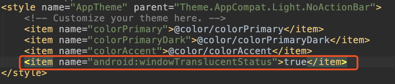
另外在布局文件中也可以设置,只需在你 App 引用的主题中添加一行代码即可:
注意:因为这个属性是 5.0 之后才有的,在实际开发中需要做兼容处理,代码中设置时需要判断一下版本,布局文件中可以新建一个 values-v21 文件夹做兼容处理。
如果你的 title 的文字跑到状态栏里了,那样会很丑,在 title 布局的根标签中添加下面一行代码就可以了:
1 android:fitsSystemWindows="true"
这行代码的意思就是不占用系统状态栏的空间。
好了,所有绘制工作都已经完成了,是不是非常简单呢?如果觉得不错的话,欢迎点赞、评论和转发,你们的支持是我坚持不懈的动力!